
Choosing the right color scheme can make or break a room. It’s not about chasing trends or copying magazine spreads, it’s about understanding how colors interact, how they shift in different lighting, and how they affect the way a space feels. Whether repainting a single bedroom or planning a whole-house refresh, the decisions made at the color stage ripple through every other design choice: trim, flooring, furniture, even hardware finishes. This guide walks through the principles, the practical options, and the mistakes that trip people up when planning interior color.
Table of Contents
ToggleKey Takeaways
- Understanding color theory fundamentals—value, saturation, temperature, and how lighting affects perception—is essential before committing to a color schemes interior design plan.
- The 60-30-10 rule (60% dominant, 30% secondary, 10% accent) creates balanced, cohesive color schemes that work across furniture and finishes without feeling monotonous.
- Always test paint samples in large 2′ × 2′ swatches on actual walls at different times of day and lighting conditions, as colors shift dramatically from paint chips to finished rooms.
- Room function and existing fixed elements like flooring and cabinetry should drive color decisions—bedrooms need cooler, lower-saturation palettes for rest, while kitchens and dining rooms tolerate warmer, bolder tones.
- Trending toward 2026, warm earthy palettes, muted jewel tones, and biophilic greens remain popular while high-contrast monochrome gains traction in modern spaces.
- Avoid common mistakes like ignoring undertones, skipping surface prep, using too many colors, or painting before testing in actual lighting—these account for most color regrets.
Understanding the Fundamentals of Color Theory for Interiors
Color theory isn’t just art class flashbacks. It’s a working framework for making intentional choices that hold up after the paint dries.
The color wheel organizes hues into primary (red, blue, yellow), secondary (green, orange, purple), and tertiary blends. But what matters more for interiors is understanding value (lightness or darkness of a color), saturation (intensity), and temperature (warm vs. cool). A pale yellow and a deep navy have the same temperature range, but vastly different values, and that contrast drives visual interest.
Warm colors (reds, oranges, yellows) advance visually, making rooms feel cozier but smaller. Cool colors (blues, greens, purples) recede, opening up tight spaces. Neutrals, grays, beiges, whites, act as bridges, letting bolder accent colors shine without fighting for attention.
Lighting changes everything. A soft gray might read blue under north-facing daylight or beige under warm LED bulbs. Always test paint samples on multiple walls and observe them at different times of day before committing to gallons. Those peel-and-stick sample sheets don’t cut it, brush at least a 2′ × 2′ square directly on the wall.
The 60-30-10 rule is a reliable formula: 60% dominant color (usually walls), 30% secondary color (upholstery, curtains), and 10% accent color (pillows, art, accessories). This ratio creates balance without monotony. Designers rely on this proportion to keep schemes cohesive across furniture and finishes.
Popular Color Scheme Types and When to Use Them
Not all palettes are created equal. The structure of a color scheme determines how versatile, or how risky, it’ll be in practice.
Monochromatic Schemes
A monochromatic palette uses a single hue in varying values and saturations. Think navy walls, powder-blue trim, slate-blue upholstery. It’s inherently cohesive and hard to mess up, making it ideal for small spaces, beginners, or rooms where texture and architectural detail should take center stage.
The challenge: without contrast, monochromatic schemes can feel flat. Layer in multiple textures, linen, wood, metal, glass, to add depth. Vary sheen levels in paint (matte walls, satin trim) to create subtle distinction. Monochromatic doesn’t mean boring, but it does demand attention to surface variety.
Complementary and Analogous Palettes
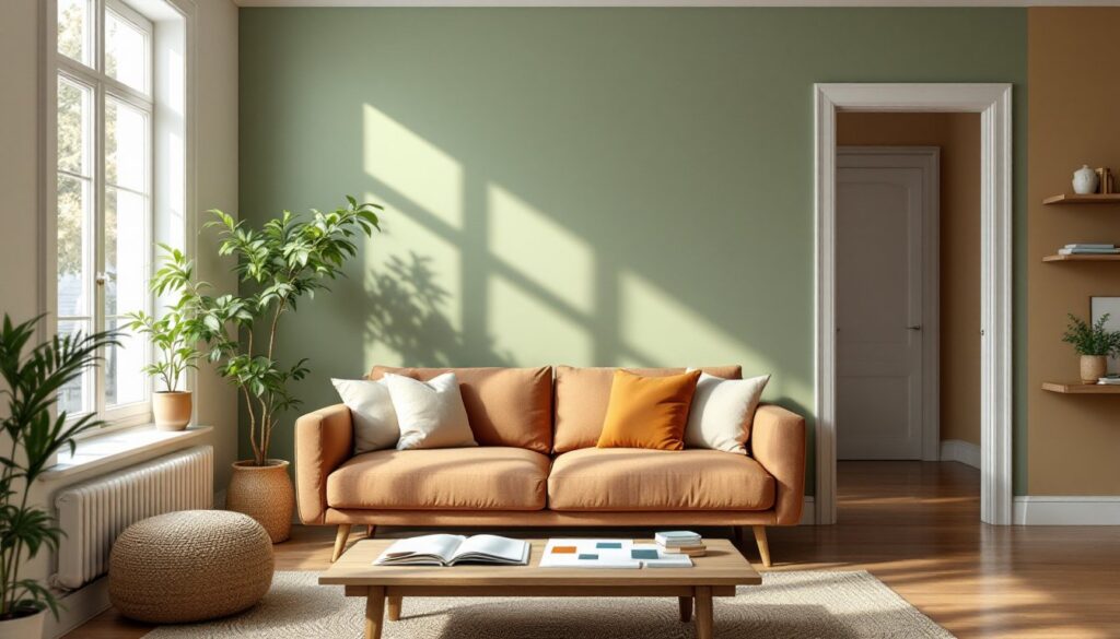
Complementary schemes pair opposites on the color wheel: blue and orange, red and green, yellow and purple. These create high contrast and energy, great for spaces that need visual punch, home offices, dining rooms, accent walls. But full-saturation complements can be jarring. Tone one down (a muted terracotta with slate blue) or use the bolder color sparingly as an accent.
Analogous palettes use three colors that sit side-by-side on the wheel, like blue, blue-green, and green. These feel naturally harmonious and work well in living rooms, bedrooms, and open-concept spaces where flow between areas matters. Analogous schemes are forgiving and flexible, especially when working across adjacent rooms. They’re a smart middle ground for anyone moving beyond all-neutral but not ready for bold contrast.
For practical application across an entire home, many homeowners rely on design strategies that balance color flow with room-specific needs.
How to Choose the Right Color Scheme for Each Room
Function and light should drive color decisions, not just personal preference. A color that works beautifully in a sun-drenched kitchen might fall flat in a basement rec room.
Living rooms benefit from analogous or neutral-based schemes with flexible accent colors. These spaces get used at all hours and by different people, so avoid extremes. Mid-tone blues, soft greens, warm grays, and taupes provide a backdrop that adapts to seasonal decor changes.
Bedrooms call for restful palettes: cooler hues, lower saturation, deeper values. Think muted sage, dusty lavender, or charcoal. Avoid high-contrast complementary schemes here, they’re too stimulating. If the room lacks natural light, don’t default to white: a deeper, warm neutral (like a greige or soft mushroom) can feel more enveloping and intentional.
Kitchens and dining rooms tolerate bolder choices because they’re social, high-energy spaces. Warmer palettes (terracotta, golden yellow, brick red) stimulate appetite and conversation. Cooler tones work too, but balance them with warm wood, brass hardware, or natural fiber rugs to avoid a sterile look. Remember that cabinetry and countertops are part of the color equation, if cabinets are bold, keep walls neutral.
Bathrooms are tricky because of tile, fixtures, and often poor lighting. Stick with lighter values to reflect available light, but don’t be afraid of color. Soft aqua, pale blush, or even a deep navy on one wall can transform a builder-grade bath without a gut reno. Matte or eggshell finishes hold up better than flat in high-humidity areas.
Basements and low-light spaces need warm, mid-to-light value colors. Avoid stark white (it’ll look dingy under artificial light) and deep, cool tones (they’ll feel like a cave). Warm beiges, soft yellows, and peachy neutrals reflect lamp light and make windowless rooms livable. Many beginners overlook lighting impact when planning basement palettes.
Trending Color Combinations for 2026 Homes
Trend forecasts aren’t gospel, but they reflect where manufacturers, designers, and retailers are heading, which affects product availability, resale appeal, and how dated a choice might look in five years.
Warm, earthy palettes continue their run: terracotta, ochre, rust, clay, and warm browns paired with soft creams and natural wood tones. This palette suits contemporary, modern farmhouse, and transitional styles. It’s grounded, livable, and flexible with both vintage and new furnishings. Expect to see these tones in tile, cabinetry, and paint selections throughout 2026.
Muted jewel tones, dusty emerald, soft sapphire, aged burgundy, are replacing the saturated jewel tones of the last few years. These feel more sophisticated and adaptable, especially when used as secondary colors rather than dominant wall colors. Pair them with warm neutrals and natural textures like linen, jute, and oak.
Biophilic greens and blues remain strong. Sage, moss, eucalyptus, and seafoam tap into the ongoing focus on wellness and connection to nature. These colors work across styles and pair well with white oak, rattan, and stone finishes. They’re especially popular in kitchens and primary bedrooms.
High-contrast monochrome is making a comeback, particularly in modern and minimalist spaces. Think black window frames, white walls, charcoal cabinetry, and light wood floors. It’s a bold choice that requires commitment and careful detailing, but the result is clean and timeless.
For those tracking broader design trends, color is just one layer, texture, materiality, and finish all play supporting roles. Trend-conscious homeowners also explore planning techniques that balance current aesthetics with long-term flexibility. Platforms like Homify offer curated examples of these palettes in real homes.
Common Mistakes to Avoid When Planning Your Color Palette
Most color regrets stem from rushing decisions or ignoring how paint interacts with existing elements.
Skipping the sample stage. Paint looks different in the can, on the chip, and on the wall. Buy quart samples and paint large swatches (at least 2′ × 2′) on multiple walls. Observe them in morning light, afternoon sun, and under evening lamps for at least two days. The extra $30 in samples beats repainting an entire room.
Ignoring undertones. Every color has an undertone, gray can lean blue, green, or purple: beige can read pink, yellow, or gray. Undertones clash or harmonize with flooring, countertops, and trim. If existing elements are cool-toned (gray tile, white oak), a warm beige will look off. Test your sample next to permanent fixtures before buying gallons.
Choosing color before testing in the actual light. North-facing rooms get cooler, bluer light: south-facing rooms get warm, golden light. A color that looks perfect in a sun-drenched showroom might turn muddy or garish in your space. Always test in situ.
Forgetting about sheen. Flat and matte finishes absorb light and hide imperfections but show scuffs. Eggshell and satin are more durable and washable, best for high-traffic areas, kitchens, and kids’ rooms. Semi-gloss works on trim, doors, and cabinetry. Sheen affects how color reads: a flat navy looks richer than a satin navy, even if they’re the same base color.
Painting before prepping. Color only looks as good as the surface beneath it. Patch holes, sand rough spots, prime stained or dark walls, and caulk gaps between trim and walls. Skipping prep is the fastest way to end up with a splotchy, uneven finish that no amount of top-coat will fix. For a well-rounded understanding of design execution, surface prep and finish quality matter as much as color choice.
Using too many colors. Stick to a maximum of three to four colors per room (including neutrals). More than that and the space feels chaotic. If adding pattern (rugs, pillows, art), let those pieces introduce variety, walls and large furniture should stay within the main palette.
Not considering flow between rooms. Open floor plans and sightlines mean adjacent rooms should share at least one color or tone family. Abrupt shifts, like a cool gray living room opening into a warm beige hallway, feel disjointed. Carry one neutral or accent color through shared spaces to create visual continuity. Understanding the difference between design and decoration helps clarify when color is structural versus surface-level. Resources like Home Bunch showcase cohesive whole-home palettes in various styles.
Finally, don’t choose paint to match a single pillow or piece of art. Accessories are temporary: paint is semi-permanent. Build the palette around fixed elements, flooring, tile, cabinetry, and let decor support it, not dictate it. If unsure, using digital design tools can help visualize color flow across rooms before lifting a brush.
Color scheming is part science, part instinct. Test thoroughly, plan around what’s staying, and trust that a well-chosen palette will make every other design decision easier.