
Contrast is one of the most powerful tools in a designer’s kit. It’s not just about slapping black paint next to white trim, it’s about creating focal points, adding depth, and making a space feel intentional. Whether someone’s working with a builder-grade box or a century-old bungalow, understanding how to use contrast can turn flat, forgettable rooms into spaces that feel dynamic and layered. It’s the difference between a room that looks “fine” and one that makes people stop and actually notice the details.
Table of Contents
ToggleKey Takeaways
- Contrast in interior design works through three main types—color, texture, and scale—each serving a distinct function to create visual interest and define spaces without requiring major renovations.
- Color contrast is the most impactful and accessible tool, ranging from dramatic black-and-white pairing to subtle warm-versus-cool combinations that prevent rooms from feeling flat and monotonous.
- Texture and material contrast add dimension to neutral spaces by combining matte with gloss finishes, smooth with rough surfaces, and natural with manufactured materials for a layered, intentional look.
- High-contrast elements like dark accent walls, two-tone cabinetry, or bold hardware become instant focal points that guide the eye and establish visual hierarchy in any room.
- Successful contrast design requires balancing boldness with restraint—one or two high-contrast focal points work better than overwhelming an entire space, and lighting must support the contrast scheme to appear intentional.
- Common mistakes like clashing undertones, ignoring scale, and skipping prep work can undermine contrast projects, so testing samples in actual light and planning adequately prevents expensive design missteps.
What Is Contrast in Interior Design?
Contrast refers to the deliberate pairing of opposing elements to create visual interest and definition. It’s what happens when a rough jute rug sits under a glossy lacquer table, or when dark cabinetry frames a white subway tile backsplash. The eye naturally seeks variation, and contrast gives it something to latch onto.
In practical terms, contrast shows up in three main ways: color (light vs. dark, warm vs. cool), texture (smooth vs. rough, matte vs. shiny), and scale (large furniture against delicate accessories). Each type serves a function. Color contrast defines boundaries and highlights features. Texture contrast adds tactile richness without visual clutter. Scale contrast prevents monotony and establishes hierarchy.
A common mistake is thinking contrast always means high drama, black walls, stark white trim, bold geometric rugs. But contrast can be subtle. A linen sofa against a painted shiplap wall. Brushed brass hardware on matte cabinetry. The principle stays the same: pair elements that differ enough to create separation and interest.
Why Contrast Matters in Your Home
Without contrast, rooms fall flat. Everything blends together, and the eye has nowhere to rest. Monochrome spaces can work beautifully, but only when they lean into texture, finish, or tonal variation, all forms of contrast.
Contrast serves several practical purposes. It defines space in open-concept layouts, especially where walls don’t naturally separate zones. A dark accent wall behind a dining table instantly carves out that area without framing or drywall. It also highlights architectural features. White trim pops against a colored wall. A wood beam ceiling stands out over painted drywall.
For DIYers tackling a refresh, contrast is one of the easiest ways to add impact without a full renovation. Paint, new hardware, a bold rug, or even swapping out light fixtures can introduce enough contrast to shift the feel of a room. Compared to moving walls or replacing flooring, it’s low-risk and reversible.
From a design standpoint, contrast helps establish a visual hierarchy. The eye moves through a room in a predictable way, drawn first to the highest-contrast elements. That’s why a black range hood in an all-white kitchen becomes an instant focal point. Designers use this to guide attention, toward a fireplace, a statement piece of furniture, or even just away from a less-than-ideal view.
Types of Contrast You Can Use
Color Contrast
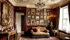
Color contrast is the most obvious and often the most dramatic. It’s about pairing hues, tones, or values that differ enough to create separation. The classic example is black and white, but there are plenty of other approaches.
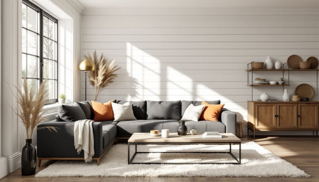
Light vs. dark is the most common form. Dark floors with light walls. A charcoal sofa against a pale rug. This type of contrast works in nearly any style, from modern farmhouse to mid-century. It’s also the easiest to control with paint, which is why it’s a go-to for DIY updates.
Warm vs. cool is subtler but effective. Think honey oak cabinetry paired with blue-gray walls, or terracotta tile against cool white grout. This approach works well in spaces where high contrast feels too harsh, like bedrooms or reading nooks.
Complementary colors, opposite each other on the color wheel, create vibrant contrast. Navy and burnt orange. Olive green and plum. These combinations can feel bold, so they’re best used in measured doses: throw pillows, artwork, an accent wall rather than an entire room.
For painted projects, remember that sheen also contributes to contrast. A flat ceiling and semi-gloss trim create subtle separation even in the same color. When working with standard paint coverage (350–400 square feet per gallon for most interior paints), plan for two coats on high-contrast transitions to avoid bleed-through.
###Azture and Material Contrast
Texture contrast is the secret weapon of neutral spaces. When color is minimal, variation in surface and material keeps things from feeling sterile. It’s also one of the easiest ways to layer design elements without committing to bold color.
Matte vs. gloss is a simple starting point. Flat-finish walls with satin-finish woodwork. A honed marble countertop next to polished chrome faucets. Gloss reflects light and draws the eye: matte absorbs it and recedes. Pairing the two creates dimension.
Smooth vs. rough adds tactile interest. A sleek leather chair beside a chunky knit throw. Polished concrete floors under a shaggy wool rug. These combinations make a space feel more lived-in and layered. They also offer practical benefits, rough textures hide wear better than smooth ones, which is worth considering in high-traffic areas.
Natural vs. manufactured materials bring in another layer. Reclaimed wood beams against drywall. A raw-edge walnut table on ceramic tile. Stone backsplash with painted cabinetry. The key is balancing refinement with rawness so neither element overwhelms.
When mixing materials, especially in kitchens or bathrooms, consider how they’ll age and maintain. Pairing a high-maintenance material (like unsealed marble) with a low-maintenance one (like quartz or porcelain) gives visual variety without doubling the upkeep.
How to Apply Contrast in Different Rooms
Kitchens are prime real estate for contrast. Two-tone cabinetry, dark lowers, light uppers, creates balance and visually grounds the space. Pair painted cabinets with natural wood open shelving or a butcher block island. Backsplash offers another contrast opportunity: white subway tile with dark grout, or a bold patterned tile against neutral cabinetry.
Hardware is an easy swap. Matte black pulls on white shaker cabinets. Brass knobs on navy lowers. It’s a small detail that has outsized impact. When installing, measure twice and use a template, most cabinet hardware is spaced 3 to 4 inches center-to-center on drawers, or mounted on the top rail of doors.
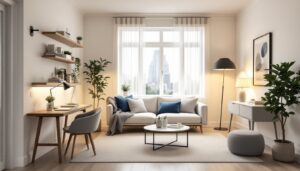
Living rooms benefit from contrast in furniture and accessories. A dark leather sofa against light walls. A reclaimed wood coffee table on a pale rug. Pillows and throws are the easiest place to introduce color or pattern contrast without permanent commitment.
Wall treatments also work well here. An accent wall in a deeper shade anchors seating areas. Board-and-batten, shiplap, or even a different paint finish (like a matte wall with a subtle gloss stripe at chair rail height) adds dimension. Many of these design strategies require only basic carpentry skills and a miter saw for clean cuts.
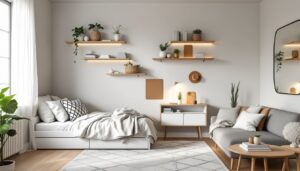
Bedrooms call for softer contrast to keep the space restful. Instead of stark black and white, try warm gray with cream, or sage green with natural linen. Texture becomes more important here, a velvet headboard, linen duvet, and woven throw create contrast without jarring the eye.
Consider contrast in lighting, too. A sculptural matte black pendant or sconce against a light wall serves as both functional task light and visual punctuation.
Bathrooms are small spaces where contrast makes a big difference. White walls with black or charcoal floor tile. A wood vanity with white countertops and vessel sinks. Frameless glass shower enclosures against patterned tile. Since bathrooms often lack natural light, contrast helps define zones and prevents the space from feeling flat.
When tiling, note that 12×24-inch tiles are popular for modern contrast schemes (large format, fewer grout lines), while smaller mosaics or hexagons add pattern contrast. Always use the correct underlayment, cement board in wet areas, and allow thin-set to cure fully per manufacturer specs, usually 24–48 hours before grouting.
Common Mistakes to Avoid When Using Contrast
Too much contrast can feel chaotic. A room with black walls, white trim, bold patterned rugs, and high-contrast artwork in every corner exhausts the eye. Start with one or two high-contrast elements and let the rest of the space breathe. As noted by designers at MyDomaine, balance is key, contrast should guide the eye, not overwhelm it.
Ignoring scale is another misstep. Pairing oversized furniture with tiny accessories, or cramming a small room with large-scale patterns, throws off proportion. Contrast works best when scale is considered alongside color and texture. For example, a large sectional in a neutral tone can anchor a room, while smaller accent pieces introduce color contrast.
Forgetting about lighting undermines contrast. A dark accent wall in a poorly lit room just looks like a black hole. Plan for adequate lighting, ambient, task, and accent, so contrast reads as intentional, not accidental. In rooms with limited natural light, layer multiple sources: recessed cans, sconces, table lamps. Aim for 50–75 lumens per square foot in living areas, more in kitchens and baths.
Clashing undertones is a subtle but common error. Warm-toned wood against cool-toned gray can look muddy if the undertones fight each other. Test samples in the actual space, in natural and artificial light, before committing. Paint samples should go on a 2×2-foot area minimum, not just a swatch.
Skipping prep work sabotages painted contrast projects. High-contrast paint schemes (like dark walls meeting white trim) show every flaw: uneven surfaces, bleed lines, missed spots. Sand, prime, and tape carefully. Use a quality painter’s tape and remove it while the paint is still slightly tacky to prevent peeling. If trim and walls are different sheens or colors, cut in with a steady hand or use a small angled brush for crisp lines.
Finally, ignoring the room’s function leads to regret. High-contrast, bold schemes work great in dining rooms and entryways, spaces meant to impress. In a home office or bedroom, where calm and focus matter, dialing back the drama usually makes more sense. Reviewing successful interior design examples can help gauge what level of contrast feels right for each space.