
Earth tones aren’t a trend, they’re a reset button for homes that feel too sterile, too busy, or just disconnected from the people living in them. In 2026, homeowners are leaning into warm ochres, soft clays, muted greens, and deep terracottas to create spaces that feel grounded and calm without sacrificing style. This palette works because it mirrors the natural world: wood, stone, soil, sand. It’s forgiving, adaptable, and ages well. Whether someone’s planning a full room makeover or just swapping out accessories, earth tones deliver a flexible foundation that pairs with almost any material or finish.
Table of Contents
ToggleKey Takeaways
- Earth tone interior design creates grounded, calm spaces by mirroring natural colors like ochres, terracottas, sage greens, and warm browns that work with nearly any material or finish.
- Test paint samples on at least two walls with different light exposure before committing, as earth tones shift dramatically throughout the day and may require two coats for even coverage.
- Balance warm earth tones (ochre, rust, camel) for cozy spaces with cool earth tones (sage, slate, taupe) in functional areas, maintaining a 60/30/10 color ratio to avoid heaviness or sterility.
- Layer earth tone interior design with textured materials like natural wood, stone, linen, jute, and wool to prevent flatness and add visual depth to restrained color palettes.
- Choose appropriate paint finishes and grout colors for each room—flat or eggshell for bedrooms, satin or semi-gloss for bathrooms, and matching earth-tone grout for cohesive tile installations.
- Select durable, moisture-resistant materials such as porcelain tile, soapstone, and epoxy grout in kitchens and bathrooms where earth tones shine through cabinetry and finishes rather than paint alone.
What Are Earth Tones and Why They Work in Modern Homes
Earth tones span a wide spectrum: warm browns, taupes, terracottas, ochres, sage greens, slate grays, and soft creams. These are colors pulled directly from nature, think clay soil, dried moss, weathered stone, and sun-bleached wood. Unlike stark whites or saturated jewel tones, earth tones sit comfortably in the mid-range of color intensity. They don’t shout for attention, which makes them ideal for layering.
Modern homes benefit from earth tones because they create visual cohesion without requiring a strict design rulebook. Open floor plans, which blur the line between kitchen, dining, and living areas, need a color strategy that flows without feeling repetitive. Earth tones handle that job naturally. A terracotta accent wall in the living room can echo a clay-colored tile backsplash in the kitchen without the spaces feeling matchy or flat.
Another reason they work: they’re forgiving with light. North-facing rooms that lack direct sunlight can feel cold with stark whites or cool grays. Warm earth tones, ochre, camel, rust, add perceived warmth even in dim light. South-facing rooms flooded with sun can handle cooler earth tones like sage, taupe, or charcoal without feeling sterile. That adaptability makes them a smart choice for DIYers who don’t want to repaint every time the season shifts.
Earth tones also play well with mixed materials. Wood trim, metal fixtures, stone countertops, linen curtains, they all share a natural, unprocessed quality that complements an earthy palette. This is why Interior Design Strategies often prioritize earth tones when working with reclaimed or sustainable materials.
Choosing the Perfect Earth Tone Color Palette
Building an earth tone palette isn’t about matching paint chips, it’s about balancing warmth, depth, and light. Start by identifying the room’s base: walls, ceiling, and large furniture pieces. These should anchor the palette with neutrals like taupe, warm gray, or cream. From there, layer in mid-tones and accents.
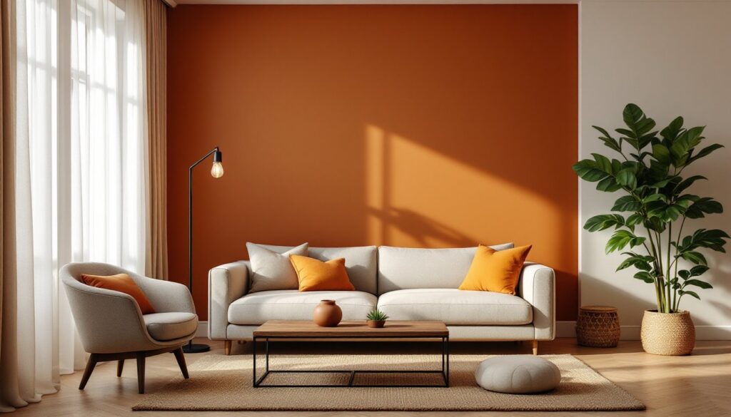
Mid-tones add character without overwhelming the space. Think terracotta, burnt sienna, olive green, or soft ochre. These work well on accent walls, upholstered furniture, area rugs, and window treatments. A terracotta accent wall in a bedroom, for example, creates a focal point without requiring bold artwork or heavy decor.
Accent colors bring depth and contrast. Deep charcoal, forest green, rust, or chocolate brown can be introduced through throw pillows, pottery, framed art, or smaller furniture pieces like side tables or benches. These darker shades prevent the palette from feeling too muted or monotone.
Test paint samples in the actual room before committing. Paint a 2×2-foot section on at least two walls, one that gets direct light and one that doesn’t. Observe how the color shifts from morning to evening. Earth tones can look dramatically different depending on natural light, and what reads as warm camel at noon might feel flat and gray by 5 p.m.
Paint coverage matters, too. Most interior paints cover roughly 350-400 square feet per gallon with one coat, but earth tones, especially deeper shades like terracotta or charcoal, often need two coats for even saturation. Budget an extra quart if painting a large room or high-traffic area where touch-ups will be needed.
Warm vs. Cool Earth Tones: Finding Your Balance
Warm earth tones, ochre, rust, camel, terracotta, golden taupe, lean toward red, orange, and yellow undertones. They work best in spaces that need coziness: bedrooms, reading nooks, dining rooms, or north-facing rooms that lack natural warmth. Warm tones also complement wood species like oak, walnut, and cherry.
Cool earth tones, sage green, slate gray, mushroom taupe, soft charcoal, carry blue, green, or gray undertones. These fit well in bathrooms, kitchens, home offices, or any space that benefits from a calmer, more neutral feel. Cool earth tones pair nicely with stainless steel, concrete, and lighter woods like ash or birch.
Most successful palettes mix both. A living room might feature warm taupe walls with sage green throw pillows and a charcoal area rug. The key is balance: too much warmth can feel heavy, while too much cool can read as sterile. Aim for a 60/30/10 ratio, 60% base neutral, 30% mid-tone (warm or cool), and 10% accent.
Lighting plays a role here, too. Warm-toned LED bulbs (2700K-3000K) enhance warm earth palettes, while neutral white bulbs (3500K-4100K) keep cool earth tones from feeling too flat. Avoid cool white or daylight bulbs in earth-toned spaces, they’ll make warm colors look muddy and cool tones look washed out.
How to Use Earth Tones in Different Rooms
Earth tones adapt to any room, but application varies based on function, moisture levels, and traffic patterns. Here’s how to handle the specifics.
Earth Tone Living Rooms and Bedrooms
Living rooms benefit from layered earth tones that create visual interest without clutter. Start with a warm taupe or soft cream on the walls, then introduce a terracotta or rust accent wall behind the sofa or fireplace. Use an area rug in a muted olive or charcoal to anchor seating areas, 8×10 feet minimum for a standard living room to avoid the “floating furniture” look.
Upholstered furniture in earth tones should lean toward durability. Look for fabrics with a Wyzenbeek rating of 15,000+ double rubs if the room sees heavy use. Linen and cotton blends work well for a relaxed feel, while performance fabrics in earth tones (camel, taupe, charcoal) handle spills and wear better in homes with kids or pets.
Bedrooms thrive with warm earth tones that promote relaxation. Terracotta, warm ochre, or soft rust on an accent wall behind the bed adds warmth without the heaviness of a fully saturated room. Pair with cream or taupe bedding and layered textures: a chunky knit throw, linen duvet, and wool or jute area rug.
Avoid glossy or semi-gloss paint finishes in bedrooms. Stick with flat or eggshell sheens, they diffuse light more evenly and create a softer, more restful atmosphere. Glossy finishes can make earth tones look muddy or uneven, especially in rooms with multiple light sources.
Kitchens and Bathrooms with Natural Appeal
Kitchens and bathrooms require moisture-resistant materials, so earth tones here often come through tile, stone, and cabinetry rather than paint alone. In kitchens, consider terracotta or slate-look porcelain tile for backsplashes. Porcelain tiles rated for walls typically have a PEI rating of 1-2, which is fine for low-abrasion areas like backsplashes. For flooring, aim for PEI 3-4 to handle foot traffic.
Cabinets in warm walnut, oak, or painted in deep olive or charcoal bring earth tones into the kitchen without overwhelming the space. Pair with quartz or soapstone countertops in muted grays or creams. Quartz is non-porous and doesn’t require sealing, making it a practical choice for busy kitchens. Soapstone develops a natural patina over time, which fits the lived-in aesthetic earth tones support.
Bathrooms handle earth tones beautifully with natural stone or porcelain tile in taupe, slate, or warm gray. For shower surrounds, use cement-based or epoxy grout in a matching earth tone to prevent the stark white grout lines that can disrupt a cohesive palette. Cement grout works for most applications, but epoxy grout resists staining better in high-moisture areas.
Paint in bathrooms should be satin or semi-gloss for easy cleaning and moisture resistance. Stick with lighter earth tones, cream, warm gray, soft taupe, if the bathroom lacks natural light. Darker tones like charcoal or forest green work in larger bathrooms with good ventilation and ample lighting. Always run the exhaust fan during and after showers to prevent moisture buildup, regardless of paint choice.
Materials and Textures That Enhance Earth Tone Design
Earth tones rely on texture and material variety to avoid feeling flat. The palette’s restraint means the tactile quality of surfaces becomes a key design element. Here’s what works.
Wood is the most natural companion to earth tones. Use it liberally: wood floors, exposed beams, floating shelves, furniture frames. Species like white oak, walnut, and hickory bring warmth and grain variation. If installing hardwood, acclimate it to the room for at least 72 hours before installation to prevent gaps or warping. Engineered hardwood (a plywood core with a hardwood veneer) handles moisture better than solid wood and works well in kitchens or basements where humidity fluctuates.
Stone and tile add weight and permanence. Travertine, limestone, slate, and terracotta tile all align with earth-tone palettes. For flooring, ensure the substrate is level within 1/4 inch over 10 feet, uneven subfloors telegraph through tile and lead to cracking. Use a self-leveling underlayment if needed before tiling.
Natural fiber textiles soften hard surfaces and add warmth. Linen curtains, jute rugs, wool throws, and cotton cushions introduce subtle texture without competing with the color palette. Jute and sisal rugs are durable but rough underfoot, layer them with a softer cotton or wool rug in high-traffic areas for comfort. For window treatments, linen offers a relaxed drape and filters light naturally, but it wrinkles easily. If that’s a concern, opt for a linen-cotton blend that holds its shape better.
Metal accents in oil-rubbed bronze, matte black, or brushed brass provide contrast without clashing. Cabinet hardware, light fixtures, and curtain rods in these finishes complement earth tones while adding a modern edge. Avoid shiny chrome or polished nickel, they read too cool and clinical against warm, muted palettes.
Plaster and limewash finishes are gaining traction in 2026 for their organic, slightly imperfect texture. Limewash paint has a matte, chalky finish that shifts slightly with the light, perfect for earth-tone walls. It’s breathable, eco-friendly, and develops a subtle patina over time. Application requires more skill than standard latex paint, but the result feels handcrafted. Apply with a natural bristle brush in random, overlapping strokes for the best texture.
Layering materials prevents monotony. A living room might combine a jute area rug, linen sofa, walnut coffee table, terracotta accent wall, and matte black light fixtures. Each element shares the earth-tone thread but contributes a different texture and finish. Techniques like those found in Interior Design Techniques emphasize material contrast to create depth in restrained color palettes. Similarly, earth-tone decorating strategies often highlight the importance of mixing textures to keep spaces visually engaging.
Don’t overlook prep work. Whether painting, tiling, or installing wood, proper surface preparation determines how well materials perform. Sand wood surfaces smooth before staining, prime walls before painting dark earth tones, and use the correct thinset or adhesive for tile type and substrate. Skipping these steps leads to uneven finishes, poor adhesion, and early failures.
Earth tone design isn’t about following a formula, it’s about creating spaces that feel intentional, comfortable, and connected to the materials around us. With the right balance of color, texture, and material, any room can achieve that grounded, timeless quality that defines the best Interior Design Ideas. Inspiration from platforms like Homedit and Homify can spark ideas for how others have layered earth tones in real homes. The key is choosing materials that age well, applying them with care, and trusting that restraint often delivers more impact than excess.