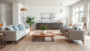
Interior design techniques can turn an ordinary room into something extraordinary. Whether someone is renovating a living room or refreshing a bedroom, the right approach makes all the difference. Good design goes beyond picking pretty furniture. It requires understanding how colors interact, why certain proportions feel right, and how light shapes a space.
This guide covers five essential interior design techniques that professionals use daily. Each technique builds on the others, creating rooms that feel cohesive and intentional. From color theory basics to strategic lighting placement, these methods work in any home, regardless of budget or style preference.
Table of Contents
ToggleKey Takeaways
- Use the 60-30-10 rule to apply color theory effectively—60% dominant color, 30% secondary, and 10% accent.
- Master scale and proportion by choosing furniture that fits your room’s dimensions and relates harmoniously to other pieces.
- Layer multiple textures like velvet, linen, wood, and metal to add depth and prevent rooms from feeling flat.
- Combine three types of lighting—ambient, task, and accent—to create flexible, well-lit spaces throughout the day.
- Establish a single focal point in each room, whether architectural or created, to anchor the space and give it purpose.
- Balance focal points with symmetrical, asymmetrical, or radial arrangements, and embrace negative space to let key elements stand out.
Understanding Color Theory and Its Impact
Color sets the mood of every room. Interior design techniques rooted in color theory help homeowners make choices that feel harmonious rather than chaotic.
The color wheel remains the most useful tool for understanding how hues relate to each other. Complementary colors sit opposite each other on the wheel, think blue and orange or purple and yellow. These pairings create energy and contrast. Analogous colors sit next to each other, like green, teal, and blue. They produce calmer, more unified spaces.
Warm colors (reds, oranges, yellows) make rooms feel cozy and intimate. They also make spaces appear smaller. Cool colors (blues, greens, purples) create a sense of calm and openness. They push walls back visually, making rooms feel larger.
The 60-30-10 rule offers a practical framework for applying these interior design techniques. Sixty percent of the room should feature a dominant color, usually on walls and large furniture. Thirty percent goes to a secondary color in upholstery, curtains, or rugs. The remaining ten percent adds accent colors through accessories, artwork, and decorative objects.
Neutral colors deserve attention too. Whites, grays, and beiges aren’t boring, they’re foundational. They let bolder elements shine without competing for attention.
Mastering Scale and Proportion
Scale and proportion affect how comfortable a room feels. These interior design techniques determine whether furniture looks right in a space or seems awkwardly placed.
Scale refers to the size of objects relative to the room. A massive sectional sofa overwhelms a small living room. A tiny accent chair disappears in a grand foyer. Getting scale right means measuring spaces carefully and choosing pieces that fit.
Proportion deals with how objects relate to each other. A coffee table should be roughly two-thirds the length of the sofa it accompanies. Nightstands work best when their tops sit level with the mattress. These ratios create visual harmony.
The golden ratio (approximately 1:1.618) appears throughout nature and art. Interior designers apply it when arranging furniture, hanging art, or dividing spaces. A room divided according to this ratio feels naturally balanced.
Ceiling height affects scale decisions significantly. Rooms with tall ceilings can handle vertical elements like floor-to-ceiling curtains and tall bookcases. Low ceilings benefit from horizontal lines and low-profile furniture that don’t emphasize the limited height.
Mixing scales adds interest to any room. Pairing a large statement mirror with smaller decorative objects creates dynamic contrast. Just keep the overall balance in mind, too many large pieces feels crowded, while too many small items looks cluttered.
Layering Textures for Visual Interest
Texture adds depth that photographs rarely capture but visitors always notice. These interior design techniques prevent rooms from feeling flat or one-dimensional.
Every material has texture. Velvet feels luxurious. Linen reads as casual. Leather suggests sophistication. Metal adds industrial edge. Wood brings warmth. Combining different textures creates rooms that invite touch and exploration.
A monochromatic room needs texture to succeed. An all-white bedroom avoids looking sterile when it combines crisp cotton sheets, a chunky knit throw, smooth ceramic lamps, and woven window shades. The varied textures provide contrast without introducing competing colors.
Hard and soft surfaces should balance each other. Too many hard surfaces (tile, glass, metal) make spaces feel cold and echoey. Too many soft surfaces (carpet, upholstery, curtains) can seem suffocating. The interplay between them creates comfort.
Natural textures ground a space. Woven baskets, wooden furniture, stone accents, and plant life connect interiors to the outside world. They work in virtually any design style, from minimalist to maximalist.
Texture also affects acoustics. Hard, smooth surfaces reflect sound, making rooms louder. Soft, textured surfaces absorb sound, creating quieter environments. Homes with open floor plans particularly benefit from strategic texture placement to control noise levels.
Strategic Lighting Design
Lighting transforms spaces more dramatically than almost any other element. Professional interior design techniques always address lighting early in the planning process.
Three types of lighting work together in well-designed rooms. Ambient lighting provides overall illumination, ceiling fixtures, recessed lights, and natural light from windows. Task lighting serves specific functions like reading lamps, under-cabinet kitchen lights, and vanity fixtures. Accent lighting highlights features, including artwork, architectural details, or decorative objects.
Layering these three types creates flexibility. A living room might use recessed ceiling lights for ambient illumination, table lamps for reading, and picture lights to showcase art. Dimmer switches allow adjustment throughout the day as natural light changes.
Color temperature matters as much as brightness. Warm light (2700-3000K) creates cozy, inviting atmospheres suited to bedrooms and living rooms. Cool light (4000-5000K) promotes alertness and works well in kitchens, bathrooms, and home offices.
Natural light remains the gold standard. North-facing windows provide consistent, diffused light ideal for art studios and offices. South-facing windows bring warmth but may require shades to manage heat and glare. Interior design techniques that maximize natural light include using mirrors to reflect it deeper into rooms and choosing window treatments that don’t block it entirely.
Lighting placement deserves careful thought. Overhead fixtures alone cast harsh shadows. Multiple light sources at different heights create depth and reduce eye strain.
Creating Focal Points and Balance
Every room needs a focal point, something that draws the eye and anchors the space. Interior design techniques for creating focal points give rooms purpose and direction.
Architectural features often serve as natural focal points. Fireplaces, large windows with views, and built-in shelving attract attention without additional effort. Designers work with these elements rather than against them.
When architectural focal points don’t exist, designers create them. A bold piece of art, an oversized mirror, a statement light fixture, or a distinctive furniture piece can anchor a room. The key is choosing one main focal point rather than competing for attention.
Balance keeps focal points from overwhelming a space. Symmetrical balance places matching elements on either side of a central point, identical nightstands flanking a bed, for example. This approach feels formal and orderly.
Asymmetrical balance uses different objects of equal visual weight on opposite sides. A tall plant on one side of a fireplace might balance a stack of books and a sculpture on the other. This feels more casual and dynamic.
Radial balance arranges elements around a central point, like chairs circling a round table. This works well in dining rooms and conversation areas.
Negative space plays a role in balance too. Not every surface needs decoration. Empty space lets the eye rest and makes focal points more powerful by contrast.